Can you rebuild a realistic button from a photo with Paper?
Trying to recreate from the masters is the best way to learn.
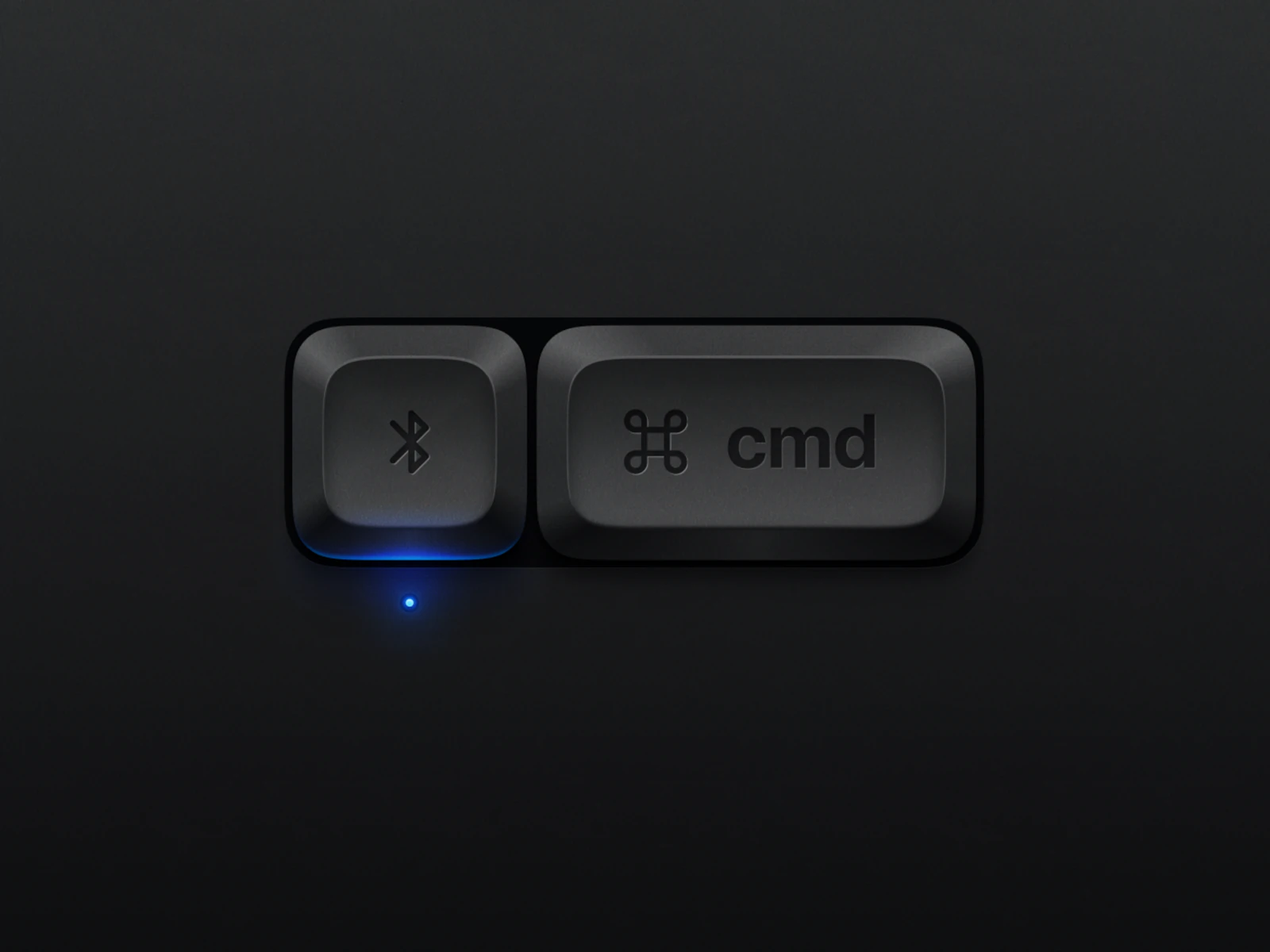
When I was learning realistic graphics in 2010, I would take Apple's icons and try to rebuild them in Photoshop. Recreating from the masters was how I learned. Realism is coming back, and I wanted to know whether these new tools and agents could make something as beautiful as this image.
Can you create beautiful, realistic buttons in Paper from an image? Yes, kind of. I found Beyza İlhan's realistic 3D buttons on Dribbble, dropped it on the canvas, and started with a plan.
I would like you to analyze these images and come up with a plan as to how you would recreate this style in Paper.

[PAPER PAGE URL]
I put Cursor into planning mode and let it do its thing. Once I had a plan together, I hit Go and let it take its first shot at recreating this image.
The first attempt was clearly not the photo, but it was much better than I had expected. What was off:
- The glyphs came out as SVGs, which Paper prefers to do for some reason.
- The border radii were off.
- The shading didn't match.
- The corners and radial gradients were missing.
- The light masking was weird.
- The spacing around the buttons was off.
- There was no pattern texture.
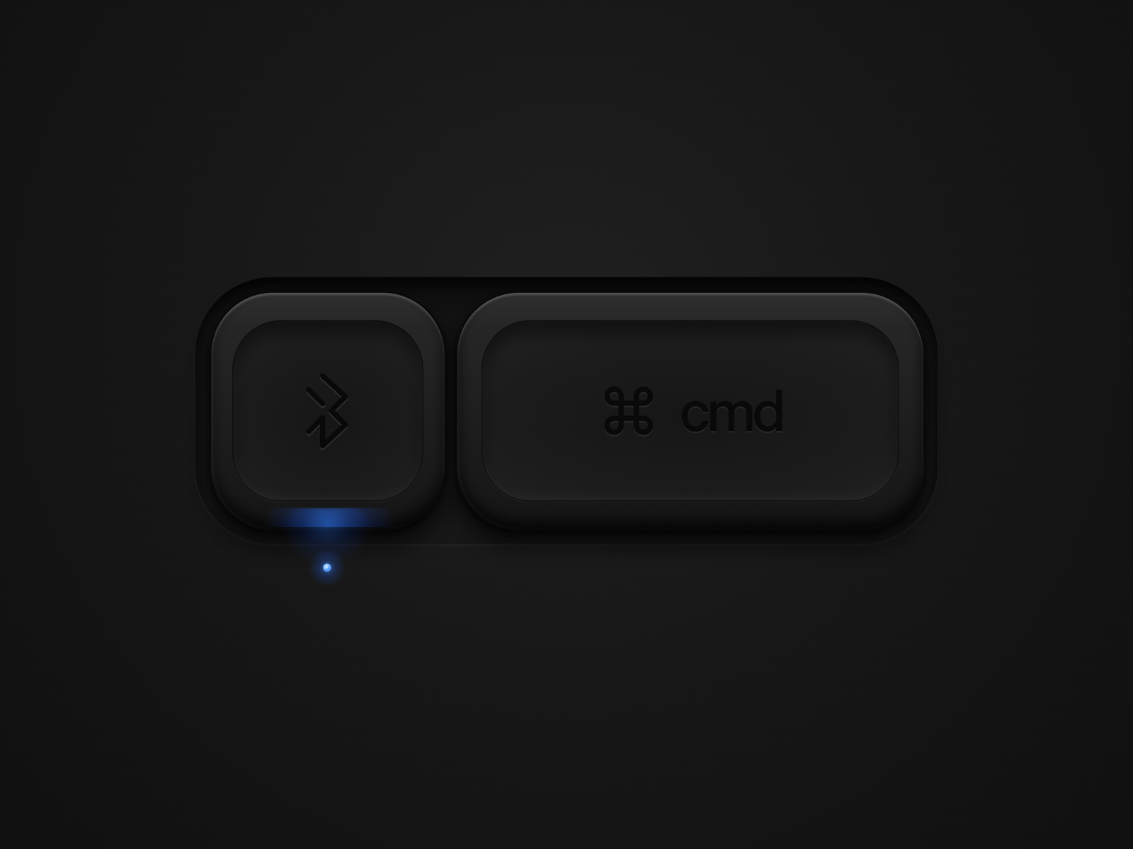
I left comments on the areas that needed help, copied the artboard, then went back to Cursor and asked it to make another pass.
Will you take and critique your work? Take a look at the original subject matter and your outputs. What did you do well? What would you change to make the output more like the reference image? Develop a plan for getting the next iteration of these buttons to match the originals as closely as possible. Pay attention to line color and gradients, border radii, layering of gradients, blend modes, clipping masks, simulation of light and the mismatch of gradient directions, etc.

Reference → [SOURCE FRAME URL]
Your first attempt → [LAST ATTEMPT URL]
I was fascinated by what Cursor did inside Paper at this point. It copied the old image, made a new one, then overlaid the original source on the canvas. I could watch it go back and forth, raising and lowering the opacity of the original to get the proportions right. That was a behavior I did not expect. As you can see, the second attempt was much better.
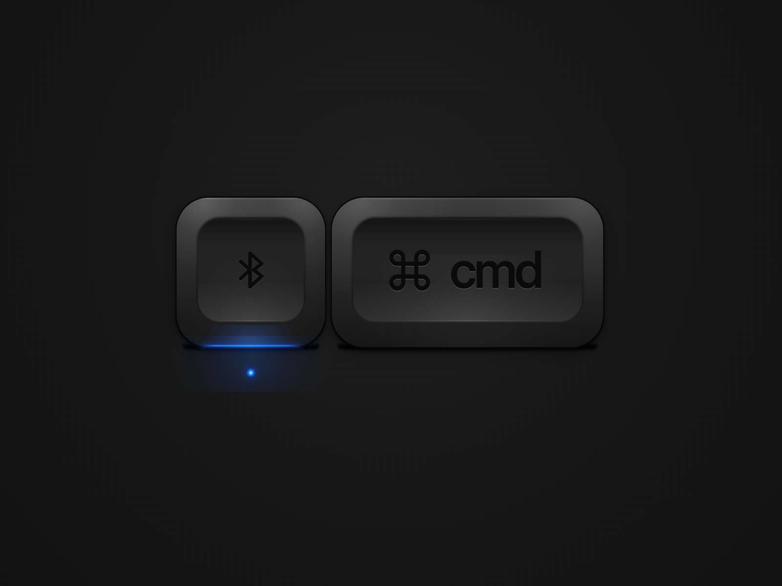
I missed the recessed tray from the first try, so I asked for it back.
One thing I actually like about what you did initially on the first try is the inset tray around these two items, and I think that's something that you could bring back in the third revision.

[LAST ATTEMPT URL]

Create a third revision directly to the right of this artboard.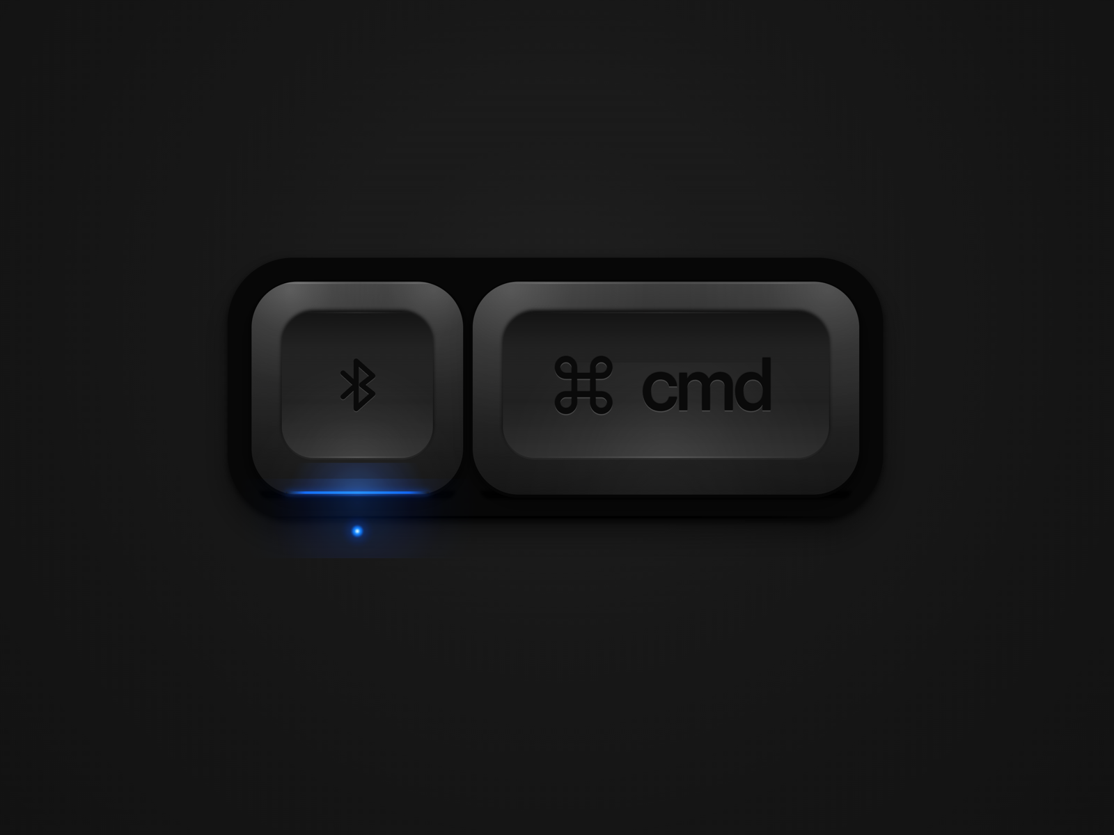
The grain was still missing. I screenshotted the noise from the original, parked it next to the third try, and commented on it.
One thing with gradients is that, oftentimes, you'll get banding. One way to avoid that banding is to create a layer that has a textural pattern. In most cases, this would be a noise pattern that is set to a pretty high opacity and then masked by the shape of the containers. I'm wondering if this is something that we can add to the next version of this button.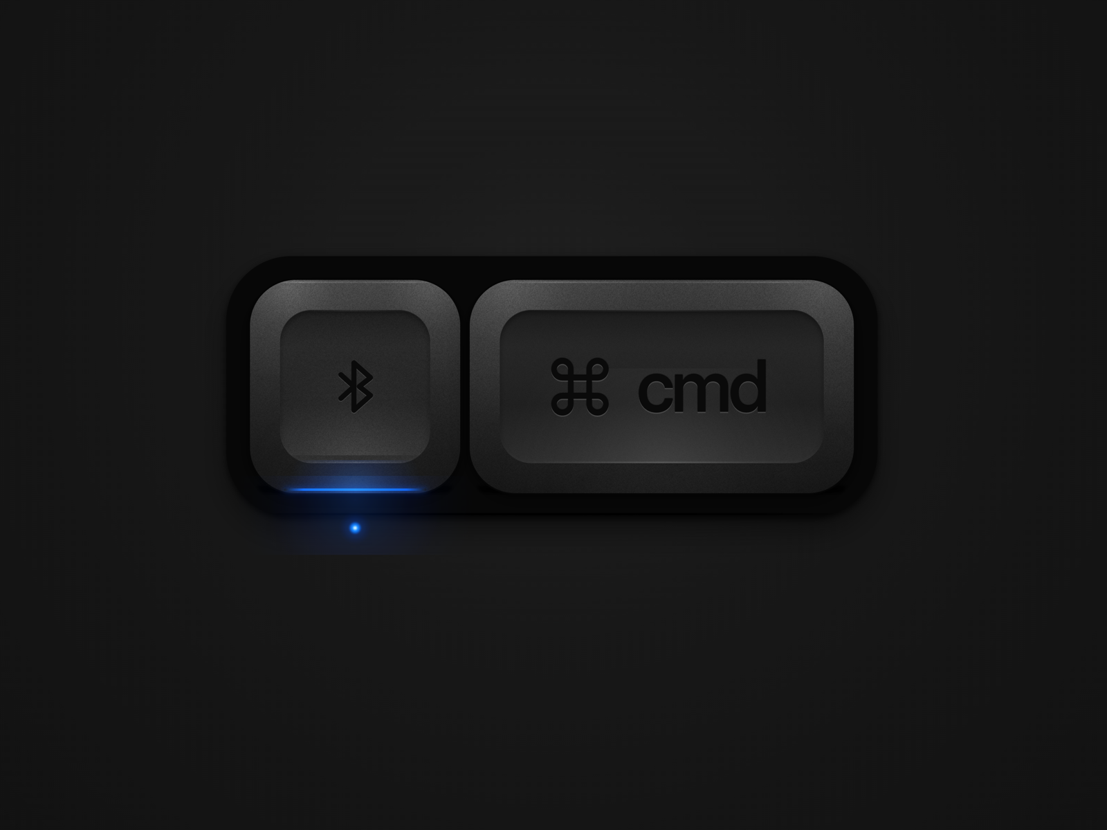
This felt about as far as Paper could go by itself. I was going to need to fine-tune the rest by hand. A few things I still don't think it handles well:
- Getting radial gradients in the right place.
- Running a gradient along a line.
- Masking certain shapes.
- Using blurs to make a soft edge without a hard line around the mask.
- Blend modes. It generally doesn't mess with them, and a lot of realism lives there.
I preferred the version without the inset, so I pulled a single Command key. On the unlit state I wanted the socket still visible.
On the single-key images where there is no glow, I want there to be a little spot in the exact same place where the blue dot is coming from that's just slightly recessed. That shows that the light is not on.

[PAPER PAGE URL]Can we take this button and create a variant that has the blue light showing up underneath it and the blue glow reflecting off the bottom of the button?
[UNLIT KEY URL]
[LIT PAIR URL]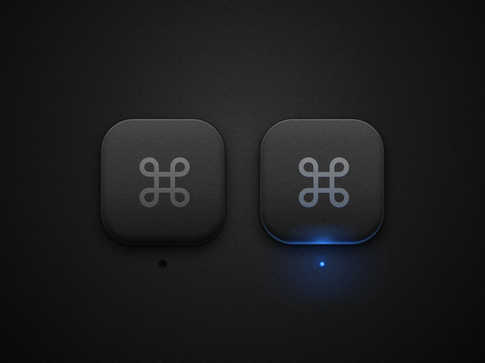
Then I took those two states into HTML.
Now, what I'd like you to do is create this button type and recreate this image in HTML and CSS. I'd like to make it so when I click the button once, it toggles the blue light on, and then when I click it again, it turns the blue light off.

[PAPER PAGE URL]You can get surprisingly far, surprisingly fast, when the canvas is HTML and CSS. Have the agent write a plan for rebuilding from the photo, then edit that plan before it draws. A second agent critiquing the first plan catches what you will miss. After the first shot, send it back to the source and have it write the plan for the next pass.
Yes, Paper can help you make realistic buttons. Go find something you'd like to recreate and give it a try.